
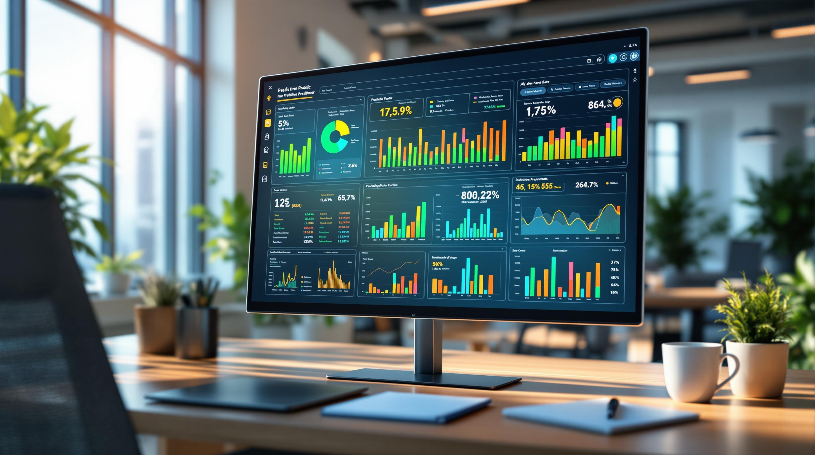
Live eSports dashboards can feel like an air-traffic display—scores, timers, graphs, chat, and animated previews compete for attention while the match keeps moving. To keep your focus on what matters, use a quiet, repeatable way to read the screen. For a neutral layout example of how sections are often arranged, you can skim this website as a simple structure reference, then come back to the steps below. The link is only for orientation, not a recommendation.
Map the context before you read any graph
Start by locating four anchors of context: match state, series format, clock, and map/round identifier. If the state flag says Live, confirm whether you’re looking at the current map/round or a series summary—many dashboards default to the series panel while a smaller widget tracks the active map. Check the clock or phase timer (round time, objective countdown, or intermission). Finally, note the identifier (Map 2, Game 3, Round 12). Context first prevents a common mistake: reading an impressive spike that actually belongs to the previous map or a pre-match preview.
A practical trick: read the breadcrumb line (Event › Stage › Match ID › Map). If any breadcrumb item doesn’t match the header above it, you’re probably in the wrong subpage or a stale tab.
Separate “live” from “next” and “overall”
Dashboards often juggle three layers of information: the live feed (what’s happening now), the next fixture (countdown and pre-view), and the overall series (aggregate). Each layer may have its own odds, graphs, or headlines. Keep them apart:
- Live is tied to the active timer and shows immediate state changes (objective secured, round win, map score increase).
- Next shows schedule items, predicted lineups, or opening numbers; it updates on a different clock.
- Overall summarizes maps won, total timeouts used, or series economy.
Never compare a live graph to the next headline. The page may place them side by side for convenience, but they answer different questions.
The three signals that carry most of the story
Dashboards can add ten widgets; you need three to keep your reading grounded.
- Scoreboard with possessions/rounds remaining. A 5–3 lead in a short round-based format is not the same as 5–3 early in a long one. Convert score into distance to finish and room for recovery.
- Objective timeline. Look for decisive moments: first capture/plant/take, power-play windows, or back-to-back objective conversions. Spikes without objective context are often noisy.
- Resource or economy curve. Whether labeled “economy,” “items,” or “utility,” this line explains future options. A temporary dip with a long-term recovery plan tells a calmer story than a dramatic kill-feed burst.
Everything else—heat maps, momentum arrows, win-probability—can help, but only after these three are clear.
How to read common widgets without getting pulled around
Win-probability bars are model outputs. Treat changes as directional, not absolute truth. A jump from 62% to 70% says “situation improved,” not “guaranteed.” Check the inputs: some models update on kills/objectives only, others on time-sliced state.
Momentum graphs compress pace into a wavy line. Use them to locate runs (three or more rounds/objectives in a row). Runs end; what matters is whether resources after the run still permit the same style of play.
Player panels highlight spikes. Cross-check with the economy/resource area; a top fragger carrying low resources may signal a fragile lead.
Mini-maps and animations are illustrative, not authoritative. If an animation and the text feed disagree, the text feed usually wins.
When you feel pulled, reset to the scoreboard, the objective timeline, and the resource curve. Those three rarely mislead you.
Avoid the most common reading errors
Two types of errors waste time: stale context and layer mixing. Stale context happens when a cached panel shows Map 1 while the live area is on Map 2. Layer mixing is reading overall stats to explain a live swing. If something looks off—like a “Final” badge beside a ticking timer—refresh the subpage, not just the browser; many dashboards load components independently.
Mobile readers: cut animation load. Disable autoplay in the page’s settings if offered, and prefer “reduced motion” modes. You’ll get faster updates on the text feed and graphs that matter, with less battery and data overhead.
A calm four-step routine you can reuse
Use the same sequence every time; it keeps your attention on facts and makes noisy pages manageable.
- Context: confirm state (Live/Final), series format, clock, and map/round ID.
- Core read: scoreboard → objective timeline → resource/economy.
- Zoom in: scan one secondary widget (win-probability or momentum) to explain why the core changed.
- Sanity check: ensure panels belong to the same layer; refresh a single widget if labels conflict.
(That’s your only list; everything else stays as prose to keep the page clean.)
Quick, practical habits for clearer dashboards
Favor official or well-maintained sources: they label layers consistently and publish changelogs for widgets. Pin your preferred live page and avoid hopping through social previews mid-match; thumbnails often point to next fixtures, not live states. On shared screens, hide notifications and use captions instead of sound—clean visuals reduce distraction for you and everyone around you. If you track multiple matches, open each in its own tab and name tabs with the map/round ID; this avoids reading the wrong card when switching fast.
Wrap-up
Live eSports dashboards reward calm readers. Begin with context, stay anchored to the scoreboard, the objective timeline, and the resource curve, and treat modeled widgets as helpful hints rather than verdicts. Keep live, next, and overall separated in your mind, and refresh the panel—not your judgment—when labels clash. With a small, repeatable routine, the screen stops shouting and starts explaining; you see the story the moment it forms, and you leave the noise behind.